“Oh no, the overall satisfaction rating from our quarterly regional meeting is down five percent from last year,” says the CMO, who then asks the event manager to “figure out what happened.”
Meanwhile, a product marketing manager looks at a different report and declares, “Our attendance was up seven percent…that new marketing campaign must have really helped.”
Event planners should be careful comparing one number against another, as two data points usually don’t make a trend. Thankfully, there are some simple and visual methods that can help us react less, lead better, and improve more.
Many organizations overreact to a comparison of two data points. Let’s say our organization runs a quarterly event. Our Q3 event this year getting a five percent lower satisfaction rating than Q3 of last year doesn’t tell us much in and of itself. The score is lower, but is it a significant difference?
We might also look at this year’s Q2 event, only to find that our Q3 satisfaction rating has gone up seven percent from Q2. Do those two data points imply things are actually getting better?
So, from that description, we have three data points. Does putting them in a table provide any more clarity? Now, we can see there was a 12-point drop from Q3 2017 to Q2 2018. Is that a meaningful decrease or is our score just fluctuating?
Event
|
Satisfaction Rating
|
Q3 2017
|
85%
|
Q2 2018
|
73%
|
Q3 2018
|
80%
|
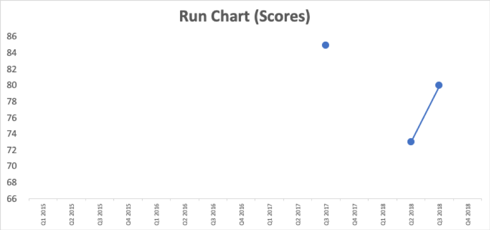
What’s a better way of knowing, for sure, if things are improving or not? We can plot the dots. Excel makes it easy to generate a line chart (aka a “run chart”).

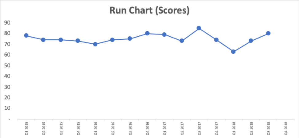
A chart with three data points doesn’t tell us much more than a list of numbers. Having a few years’ worth of data makes the chart even more meaningful.

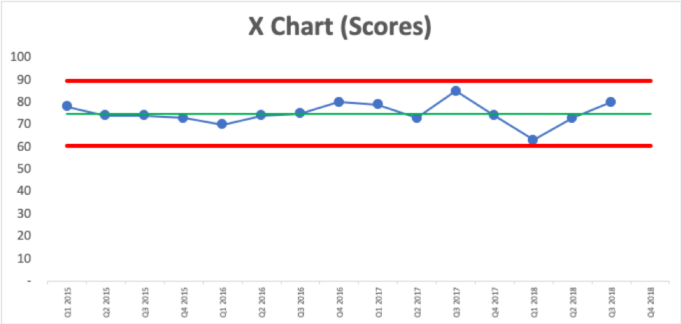
How do we know if any of those data points are worth investigating? Thankfully, we can use a “Process Behavior Chart” to determine this. This form of statistical analysis adds three lines to the chart from a baseline timeframe (in this case, our 16 data points):
- Average (the green line)
- Lower Natural Process Limit (the lower red line)
- Upper Natural Process Limit (the upper red line)
The “X Chart” (as it’s also called) looks like this:

The customer satisfaction score is fluctuating around an average of 75. This is a predictable system. We might not be happy with the average and the range of the scores, but we can predict that future events will have a score that falls between the red lines, or roughly 60.6 and 89.4 – unless something changes significantly in the system.
Every metric is going to have some amount of routine fluctuation, even if the underlying events are basically the same (a similar event, in a similar space, with a similar audience, with similar speakers of similar quality, etc.). a Process Behavior Chart filters out the noise in a metric, so we can find signals of changes that are worth investigating or understanding.
For details about how to calculate the lower and upper limits, check out my blog post via KaiNexus.
All of the data points shown in the Process Behavior Chart are noise. There are no signals. There’s no single easy answer to questions like, “Why did we have an score of 85 that quarter?” or “Why did it go down from 79 to 73?” Questions that ask people to investigate or explain noise in a metric end up wasting time – time that would be better spent improving our events.
There are three simple rules that we use to look for a signal in an X Chart:
- Rule 1: Any single data point outside of the limits
- Rule 2: Eight consecutive points on the same side of the average
- Rule 3: 3 out of 3 (or 3 out of 4) points that are closer to the same limit than they are to the average
When we find a signal, that is a good time to ask, “What happened?” or “What changed?” We could try to figure out why we had the one score of 63, which is just above the lower limit, so it’s technically not a signal. Trying to figure out what was different about that event is a better use of time than asking what was different about an event that was just barely below average and lower than the previous event. We might not find a valid reason for the 63 score as it could be, again, that it just fluctuated.
A signal, when we do find one, tells us, with a high degree of statistical certainty, that something changed in a significant way in our events. We can discover a signal and then go investigate. Or, we can intentionally change our events and then use a Process Behavior Chart to evaluate if our metric has truly improved or not after the change.
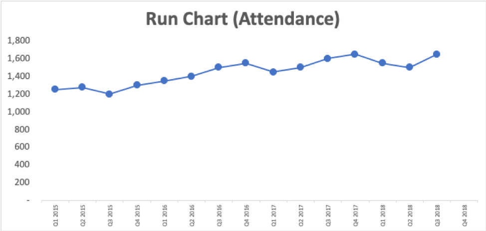
Let’s look a run chart of some event attendance numbers:

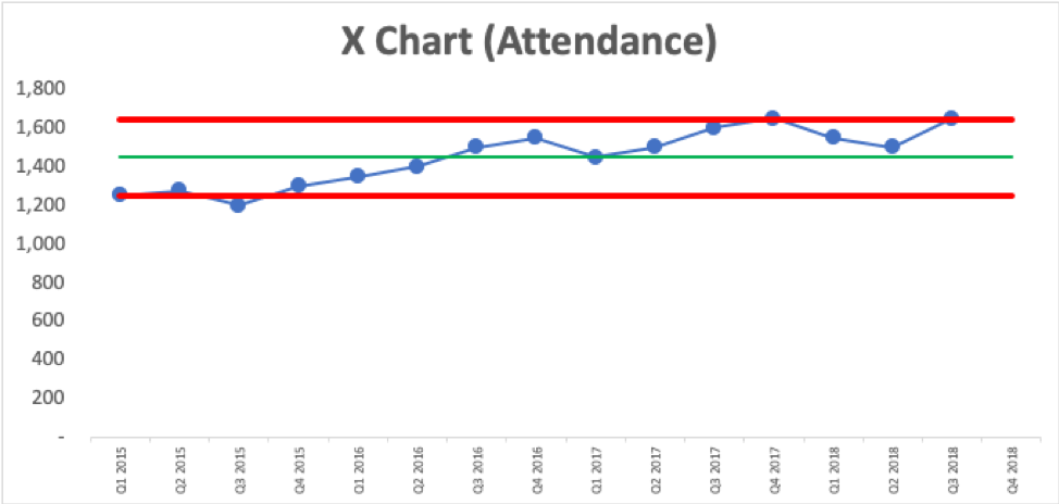
It looks like we might have an upward trend. Creating a Process Behavior Chart shows us that it’s not just fluctuating around an average:

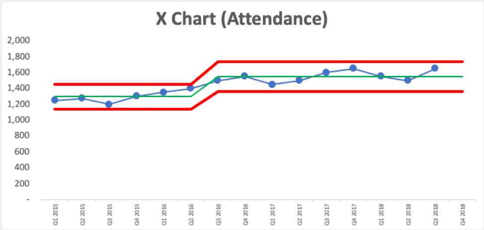
The last nine data points are above the average, which is a signal that attendance is likely now fluctuating around a higher average than it was before. We also have two data points that are just slightly above the upper limit, another signal of changes. We can draw the Process Behavior Chart in a way that shows this shift in performance with averages and limits that have changed over time. It appears there was a step function improvement in attendance.

We can see that average attendance has increased from 1300 to 1550. Do we know what changed starting in Q3 2016 that led to this increase? Was that when the new marketing campaign started? If so, great. If not, we should figure out why attendance jumped up (and we might decide the marketing campaign didn’t have a huge impact after all).
What matters more than a seven percent increase is that the chart tells us that we’ve sustained the improvement and attendance will continue to fluctuate within those red lines unless we, again, come up with an improvement to our event.
Or, we can go to work improving the attendee satisfaction score. If we make a change to the Q4 2018 event, we’d look at the chart to see if the next score is above the upper limit of 89.4. Or, we can look for three consecutive quarters scoring above 82.2 (the halfway point between the average and the upper limit). Or we can look for eight consecutive quarters that are above the average of 75. Some of these signals take time to appear, but they’re a more meaningful indicator of change instead of getting overly excited about every small uptick.
While I used satisfaction scores here, another type of common measurement is the net promoter score (NPS). While these are typically tracked by product management, product marketing or corporate development, events can influence NPS. If your organization tracks NPS, it could be interesting to see if you can spot any trends that could get more positive recognition for events.
Methods like Process Behavior Charts, or even simple run charts, are more useful than two-data-point comparisons. I hope they are helpful to you in your event planning.


